This map shows burned areas in a study region. It provides you with rich information on single fires as well as summary information on a study area or on protected areas within a study area. Furthermore you have access to the latest as well as historical daily MODIS and VIIRS images, and to current and past Landsat 8 data.
You can zoom in and out using the +/- buttons in the upper left corner or using your mous wheel. You can move the map by dragging it (just as in Google maps).
Burned areas are color coded based on the biomass consumed (the darker, the more biomass burned per sqm).
To get information on a fire event, right click on the burned area (on touch-screen devices: hold your finger on the burned area) to invoke a context menu and select “get info”.
When you press “get info”, a dialog pops up, giving you all available information on the fire event, such as:
- when was an active fire or burned area first detected ? (dates for burned area and active fire detection may differ due to different methodologies)
- when was the fire last detected?
- how much biomass was consumed by this fire? (total and per sqm, with error margin)
- what is the estimated amount of greenhouse gases emitted by the fire?
- what are the main land cover types affected?
Furthermore, you will find a number of charts at the bottom of the popup page:

The fuel consumption chart (above) tells you about the fuel consumed based on satellite fire detections:
- when the fire was observed and how intense it burned at each observation (red dots).
- when the fire was (partly) obscured by clouds
- the modelled fuel consumption rates for this fire (blue line), which provide information
- graphical information on the biomass consumption rates derived from infrared satellite data (above). This gives you information on:
- total fuel consumption.
This information is derived from fire radiative power, i.e. the heat release rate of the fire, which is measured form infrared sensors in space (currently we have data from the MODIS sensor on board the NASA Terra and Aqua satellites).
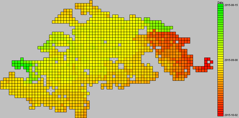
Fire spread graph (only MODIS data, above):
- this graph provides you a map of the burned area color-coded by the “most probable” day of burning. This day of burning has an uncertainty of a number of days, e.g. because the fire may have been obscured by clouds the day it actually burned.
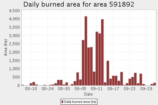
Bar chart of daily area burned (above):
- this bar chart gives you information on the daily burned area based on the MODIS burned area data

Bar chart of the daily fuel consumption (above):
- this bar chart gives you information on the daily fuel consumption. You may note that in some cases it will not align too well with the burned area data. This may be due to the uncertainty of the day of burning in the burned area data, or because of uncertainties in our model, or simply because a fast spreading fire does not necessarily consume lots of fuel.
Information on protected areas or the whole study area: When you invoke the popup dialog while being over a protected area (green areas), you will get summary information on this protected area. You will also get the same information for the whole study area:

- burned area (above), biomass burned
- emission time series for the area (see chart below)
- summary charts on this information, including error bars.

Layer control: you open the layer control by hovering over the layers symbol in the upper right corner:
- Background maps: you can select different background maps or background satellite images
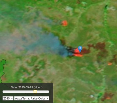
- Satellite images: time enabled satellite images are available as a background from the NASA GRIBS or the ESRI Landsat service. When you select a time enabled satellite image, a time slider will appear at the left bottom of the map. You can select the year using the dropdown box, set the date using the slider, and select the data source (not available for Landsat) using the right dropdown on the slider. You can move the time slider with the mouse/fingers or with the back and forward keys on your keyboard. Images from Landsat are available starting from 2015 (with some images available for 2014), and images acquired up to 16 days before the selected date will be displayed. It usually takes a few seconds before the image appears. In some cases there will be gaps that stay grey. This tool helps you to track the fire spread over time. MODIS and VIIRS images appear within several hours from acquisition.
Landsat image (every 16 days):

MODIS image (~twice daily morning/noon):
- Protected areas: switch on and off the protected areas layer
- Burned areas: burned areas are displayed by year of start date of the fire. Using MODIS data, burned area time series back to 2003 can be calculated. If you display several years on top of each other, you will get information on all fires at a location if you invoke the fire information popup on that location. It will, however, take a bit longer to load.
- Active fires: MODIS active fires color coded after the fire radiative power for each year.
- Daily fire detections: Daily fire detections are available from the NASA FIRMS server for MODIS and S-NPP VIIRS (a new instrument with a 375 m resolution fire detection product). You can use the time slider to check on the daily spread of each fire.